
I thought for a long time about the final CD cover because I wasn’t sure what I wanted.
At the beginning, I thought of creating something related to the “creative confusion”. What I had in my mind was the image of a man with is head replaced by a cage and from the open window of the cage: thoughts, words, music and images that flowed away.
Browsing on web my attention was caught by the following images.


Image source: http://static4.depositphotos.com/1007073/280/v/950/depositphotos_2806851-Retro-gramophone.jpg and http://fc05.deviantart.net/fs71/f/2010/343/9/6/gramophone_by_anti_pati_ya-d34ixlt.jpg
I immediately liked them for two reasons: the vintage look and the “cloud”. I searched for a free gramophone image online: The first one is a .Jpeg image and the second one is an .EPS. This means that I can easily modify it using Illustrator because it is a vector file


sources – http://www.ermannocottini-poesiainsitu.it/uploads/Amore/grammofono.jpg and http://www.vintagevectors.com/objects/old-phonograph-gramophone-vector/
I imported the first image in Illustrator and I traced it using the pen tool. Using Photoshop I cut off only the speaker and I applied a Gaussian Blur because I wanted to keep the original image as filling


I started drawing the “sound’s waves” using the pen tool and I colored them using the mesh tool. In the end, I wasn’t satisfied because I didn’t like my gramophone and in particular, I didn’t like the direction it was facing.
I wanted something facing inwards in order to give depth to the image.
Of course, the second vintage gramophone image was more suitable. For this reason, I started modifying the original path of the EPS. In essence, I cut out the lower part of the image and I kept the speaker. I also kept the original waves that I designed before and I colored them in light blue. I copied them several times and, changing the opacity of those on the background, I think I’ve created very nice “smoking effect”


I tried several different plain backgrounds, but the image looked flatting out. I tried withsome pattern and graphic styles but it didn’t work as well.
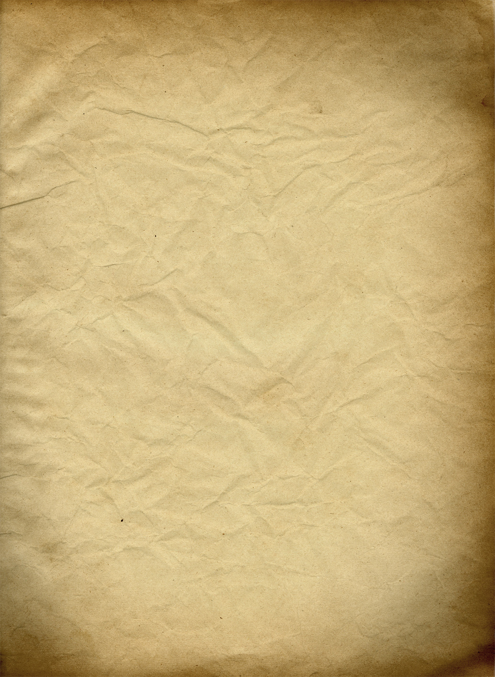
So, I thought of some crumpled paper and I found online this fantastic texture that, in my opinion, is perfect for the style of the CD cover. I placed that as background and the cover, immediately, looked vintage

source – http://fc01.deviantart.net/fs28/f/2008/067/f/2/Paper_texture_1_by_wojtar_stock.jpg
Now, it was time to think about a title. I wanted something related to the music and design as well. The association of the words “Sound” and “Design” came in to my mind… and that’s how I invented the title “Sound Design”.
For the title, I tried many different kinds of fonts and different positions and rotations. I even tried to type on a wave’s path using “Type on a path tool” but, what I got, still didn’t convince me.
I wanted something simple but at the same time having the “wow” factor.


In a kind of “stroke of genius”, I imagined a tearing on my paper and I created it simply drawing a rough and irregular path using the pen tool and, then, I distorted it using Pucker and Bloat.
After creating the “tear”, I needed a shadow effect in order to make it more realistic. I simply duplicated the path a couple of time and then I joined them using Blend Tool and getting a progressive faded shadow.


Simply copying the tore paper (without the shade) a created a banner with a neutral background color.
The following is the final result and I must admit that, when I saw it completed for the first time, I felt in love with it and I thought I was on the right direction!

For the title, I tried a couple of fonts then I opted for “FFF Tusj Bold” on front and “NightOut Bold” (opacity 90%) on the tear’s background. In the end, I used the clipping mask to fit everything on the front of the CD


For the back, I reused the same idea of the front: I created 4 different tears and I changed their position and rotation to make them all different. I added the artist, the song name and other information for each entry.
I used “FFF Tusj Bold” font for numbers, “Chalkduster” for the artist and song title and “Gill sans” for the other pieces of information.


After inserting my design in the CD Layout, I added a quote by Bob Marley on the bottom of the sleeve. I’ve always liked this quote and I think that it describes perfectly my idea of music. I also typed again the title of the compilation on the two side edges, once folded those two writings will be on the spines of the CD.

I added on my front cover some writings (opacity 50%) on background (font “Speedy”) and more precisely, they are the names and titles of my tracks list. I fitted everything in my layout and I clipped the edge in correspondence of the bleed.
The final touch of style was adding a couple of light blue banners on the spines of the CD


Here is my CD cover. I’m very happy with it because I think I achieved a very nice result:both with color and style. I also really like the brown and light blue, together as they add up the initial sense of “Vintage” that I was looking for.
The last thing left to do is the disk design.
 I decided to make my design directly on the disk template. I wanted it to be simple and reflecting the CD cover. For this reason, I imported the same front design, leaving out the gramophone and the writings to keep it “lighter”


I cropped the final design using clipping mask to have a better point of view on the disk.

 And here it is the final result.

If you want see better resolution images I made also a .ppt presentation, get it clicking here Sound Design
